
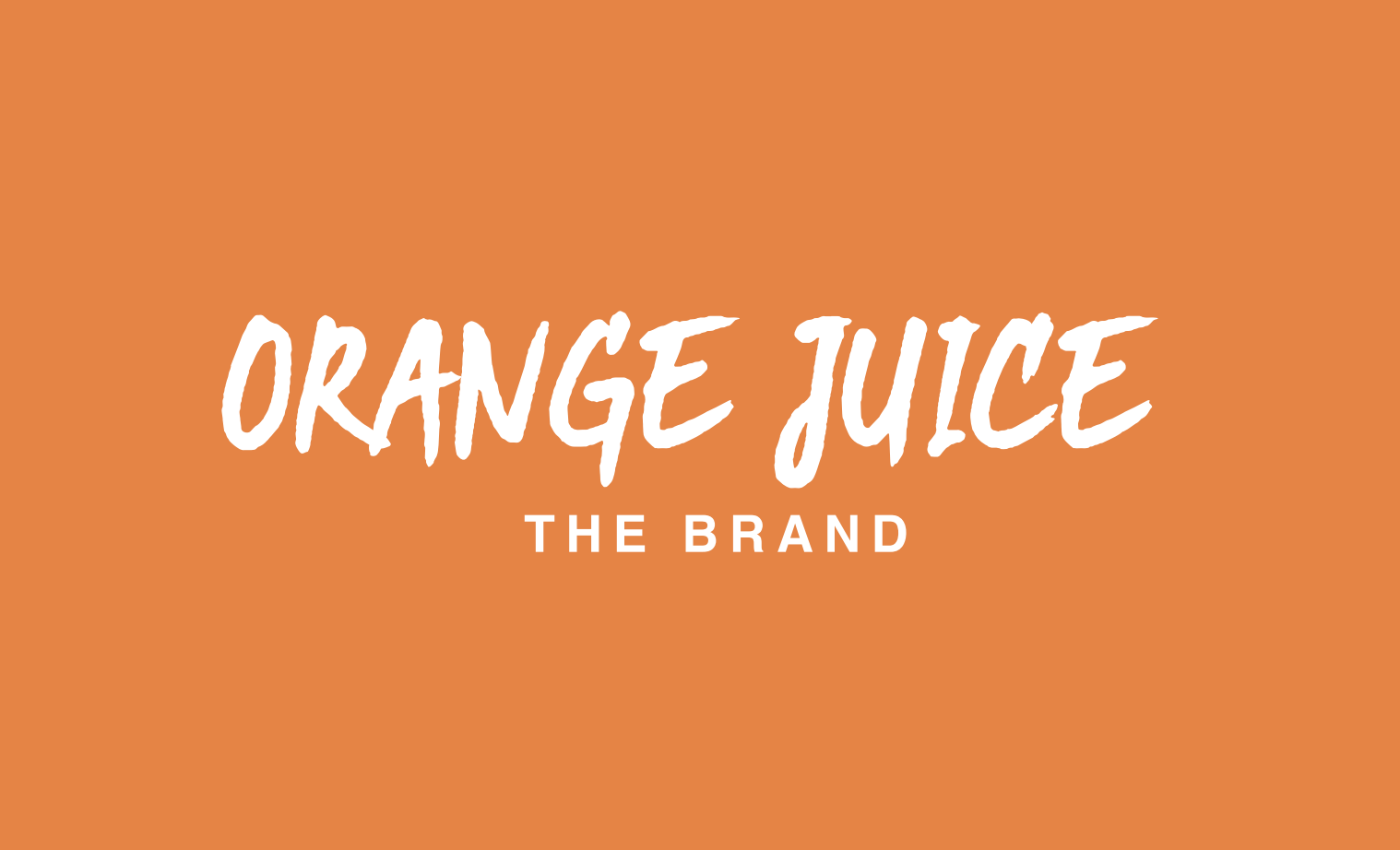

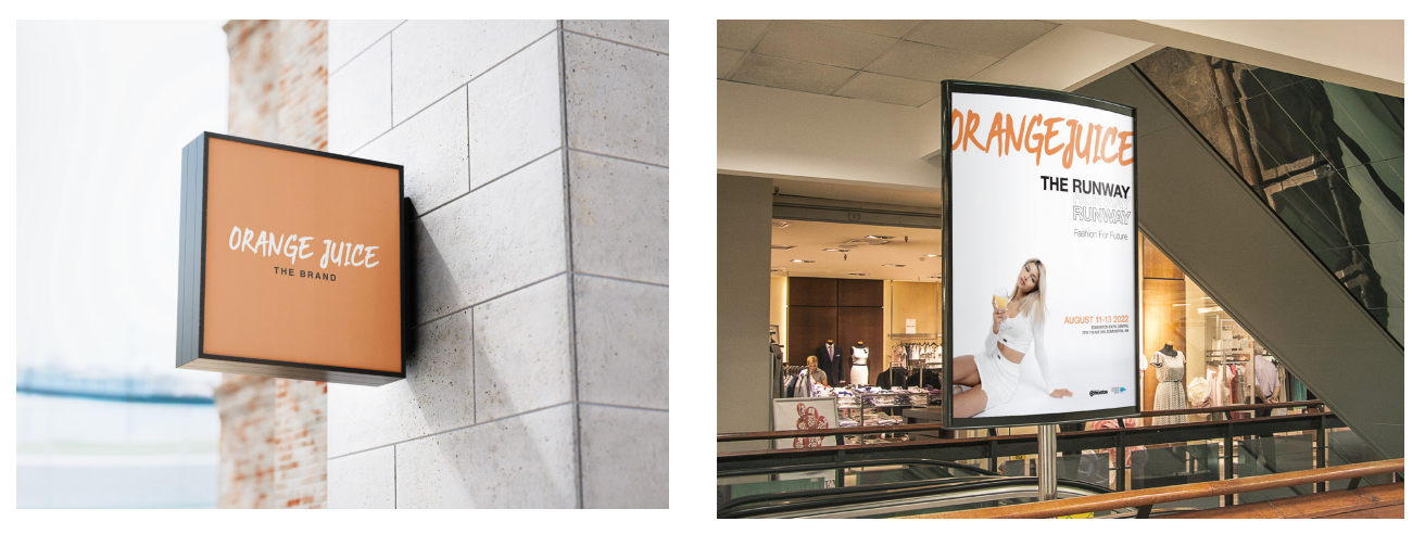
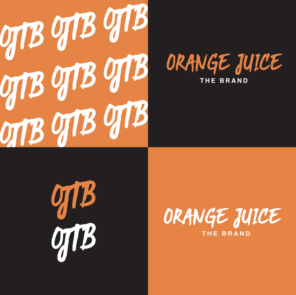
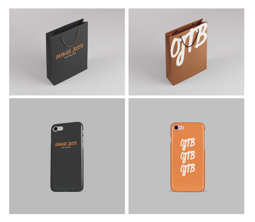
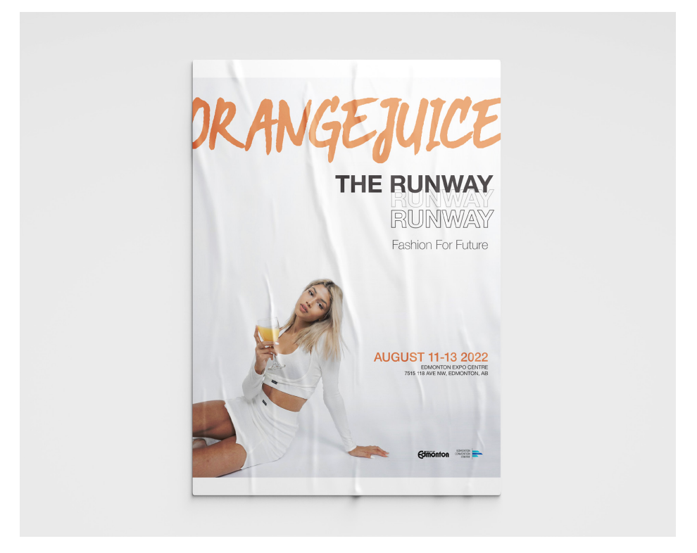
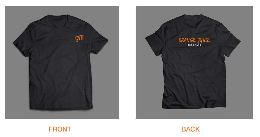
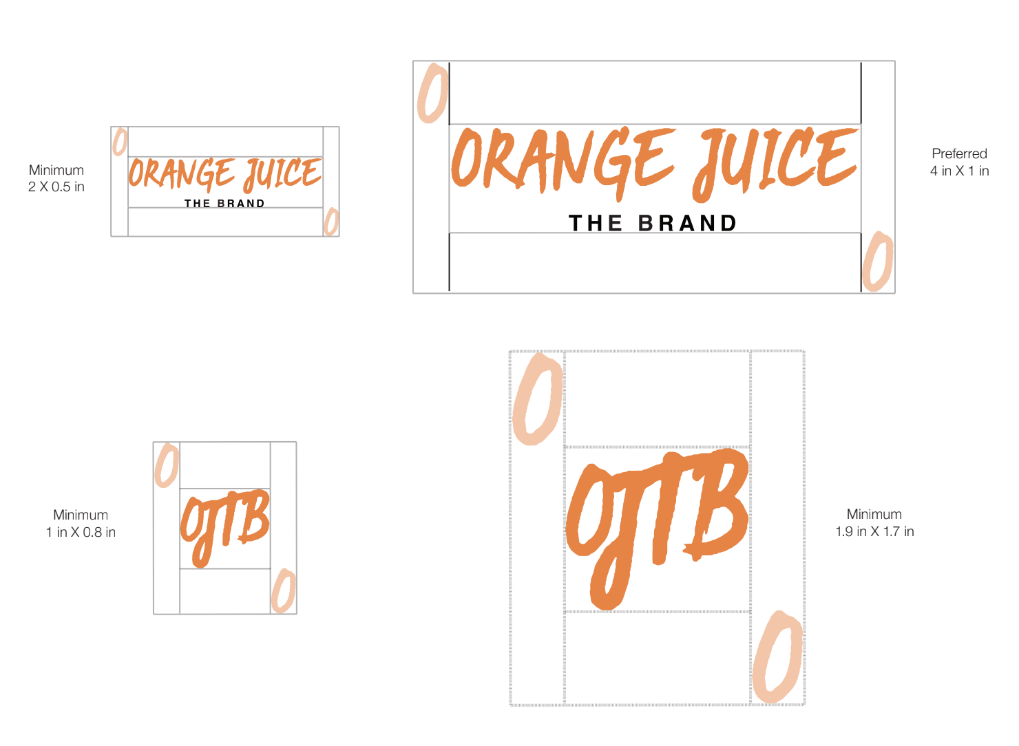
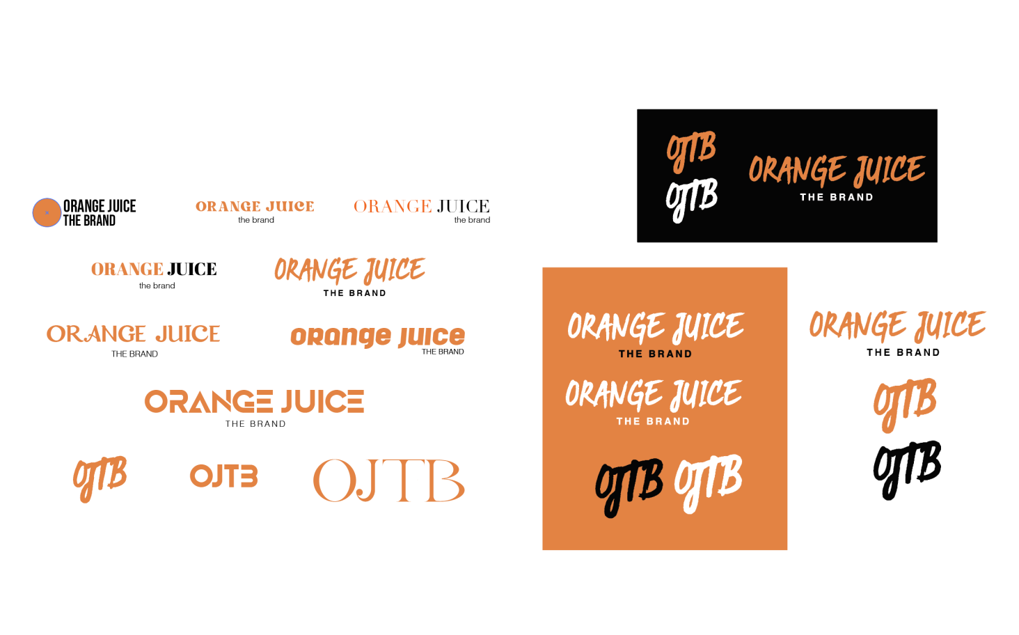
The rebrand of OJTB embodies boldness and versatility, inspired by the simplicity of the original logo. I added a personalized, handwritten-style font to bring authenticity. A secondary logo using the brand’s initials was created to address the long name, with the connected letters symbolizing forward movement—aligning with the brand's growth goals.
Branding